Introduction to PlutoLayout
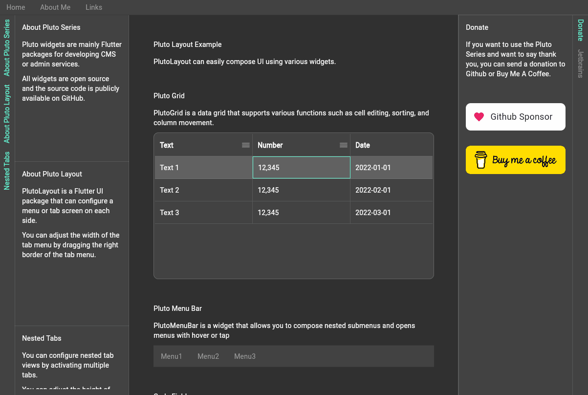
PlutoLayout is a Flutter package for configuring layouts such as CMS or admin service.
You can configure tab views or menus on the top, bottom, left, and right sides.
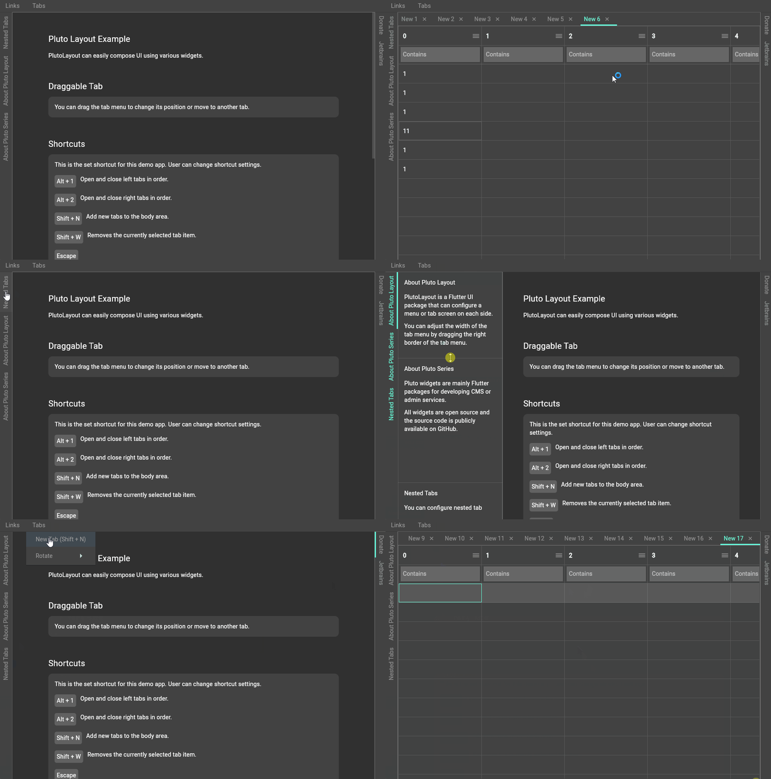
It also supports keyboard shortcuts and allows you to toggle or resize the tab view.
Default container PlutoLayoutContainer
You need to set the body container by default, and you can optionally add containers to the top, bottom, left, and right sides.
final layout = PlutoLayout(
  body: PlutoLayoutContainer(
    child: Text('body container'),
  ),
  top: PlutoLayoutContainer(
    child: Text('top container'),
  ),
  bottom: PlutoLayoutContainer(
    child: Text('bottom container'),
  ),
  left: PlutoLayoutContainer(
    child: Text('left container'),
  ),
  right: PlutoLayoutContainer(
    child: Text('right container'),
  ),
);
Tab Widgets PlutoLayoutTabs
The tab widget consists of a menu button and a tab view area that is opened or closed when the menu button is toggled.
final layout = PlutoLayout(
  // This is a property that should be set by default.
  // It is centered in the layout.
  body: PlutoLayoutContainer(
    child: Text('body container'),
  ),
  // This is an attribute that can be optionally added.
  left: PlutoLayoutContainer(
    child: PlutoLayoutTabs(
      // This property sets the size of the tab view.
      // If the size of the tab view is left or right, it means the width.
      // In the case of top and bottom, it means the height.
      // In this example code, the left property is set,
      // so the size means the width.
      tabViewSizeResolver: PlutoLayoutTabViewSizeConstrains(
        minSize: 100,
        maxSize: 500,
        initialSize: 300,
      ),
      items: [
        PlutoLayoutTabItem(
          id: 'Files',
          title: 'Files',
          icon: Icon(Icons.file_present),
          // This property sets the size of each tab view.
          // If the size of each tab view is left or right, it means the height.
          // In the case of top and bottom, it means the width.
          // In this example code, the left property is set,
          // so size means height.
          sizeResolver: PlutoLayoutTabItemSizeFlexible(0.3),
          // This is a callback function that returns a widget
          // that is displayed when the tab menu button is tapped.
          tabViewWidget: Text('Files tab view'),
        ),
        PlutoLayoutTabItem(
          id: 'Users',
          title: 'Users',
          icon: Icon(Icons.account_box),
          sizeResolver: PlutoLayoutTabItemSizeFlexible(0.7),
          tabViewWidget: Text('Users tab view'),
        ),
      ],
    ),
  ),
);
Additional explanation of tab widget size setting
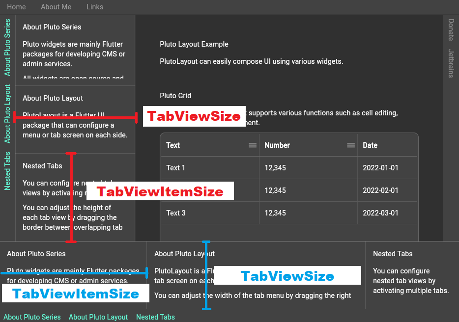
The size of the tab view that appears when the menu of the tab widget is toggled depends on the direction in which the tab widget is positioned.
In the case of left and right tabs, the size of the tab view means the width.
For top and bottom tabs, the size of the tab view means the height.
Here, a tab view means a container that wraps all tab items.
Also, in the case of the size of the tab view of each item,
In the case of left and right tabs, the size of the tab view of each item means the height.
In the case of top and bottom tabs, the size of the tab view of each item means the width.
Size of TabViewSize
- The size of
TabViewSizeis set by addingtabViewSizeResolverproperty ofPlutoLayoutTabs.
If not set, the size is automatically set to fit the screen size. - Set
PlutoLayoutTabViewSizeFixedandPlutoLayoutTabViewSizeRatioto a fixed size.
Once set, the size cannot be changed, and when the size of the parent widget ofPlutoLayoutis changed, the size may change automatically. PlutoLayoutTabViewSizeConstrainscan limit the minimum and maximum sizes, and you can also set the default size.
You can change the size after it is set.
Size of TabViewItemSize
- The size of
TabViewItemSizeis set by adding thesizeResolverproperty of eachPlutoLayoutTabItem. If not set,PlutoLayoutTabItemSizeFlexibleis set to a value of1. PlutoLayoutTabItemSizeFlexiblecan pass a value between0and1, and will be set to1if not passed. When two items are activated, assuming that both items have a value of1, the size is set in a ratio of1:1.PlutoLayoutTabItemSizeInitialsets the initial size when the tab item is activated.
Shortcut settings
Shortcuts work with Flutter's Shortcuts widget.
You can pass desired shortcuts and Actions to the shortcuts property of PlutoLayout.
final layout = PlutoLayout(
  shortcuts: {
    // Pressing the Escape key closes all currently open tab views.
    LogicalKeySet(LogicalKeyboardKey.escape):
        PlutoLayoutActions.hideAllTabView(),
    // When Alt + Number 1 is pressed,
    // the items registered in the left tab are opened and closed in order.
    LogicalKeySet(LogicalKeyboardKey.alt, LogicalKeyboardKey.digit1):
        PlutoLayoutActions.rotateTabView(
      PlutoLayoutContainerDirection.left,
    ),
    // If you press Alt + Number 2,
    // the items registered in the right tab are opened and closed in order.
    LogicalKeySet(LogicalKeyboardKey.alt, LogicalKeyboardKey.digit2):
        PlutoLayoutActions.rotateTabView(
      PlutoLayoutContainerDirection.right,
    ),
    // Press Alt + Right Arrow to increase the size
    // of the currently focused tab view.
    // The reverseByDirection property is a property to change
    // the width according to the logic according to the left or right tab view.
    // For example, in the case of the left tab view,
    // we want to increase it by pressing the right arrow key.
    // But in the case of the right tab view,
    // we want it to be decreased when the right arrow key is pressed.
    // Each shortcut can be assigned,
    // but if you need to increase/decrease according to the logic with one shortcut
    // Just set the reverseByDirection property to true.
    LogicalKeySet(LogicalKeyboardKey.alt, LogicalKeyboardKey.arrowRight):
        PlutoLayoutActions.increaseTabView(reverseByDirection: true),
    // Press Alt + Left arrow key to decrease the size of the currently focused tab view.
    LogicalKeySet(LogicalKeyboardKey.alt, LogicalKeyboardKey.arrowLeft):
        PlutoLayoutActions.decreaseTabView(reverseByDirection: true),
  },
  body: PlutoLayoutContainer(
    child: Text('body container'),
  ),
);
If you have additional questions or features that need to be added, please register in the GitHub issue.
PlutoLayout Github
