Introduction to PlutoMenuBar
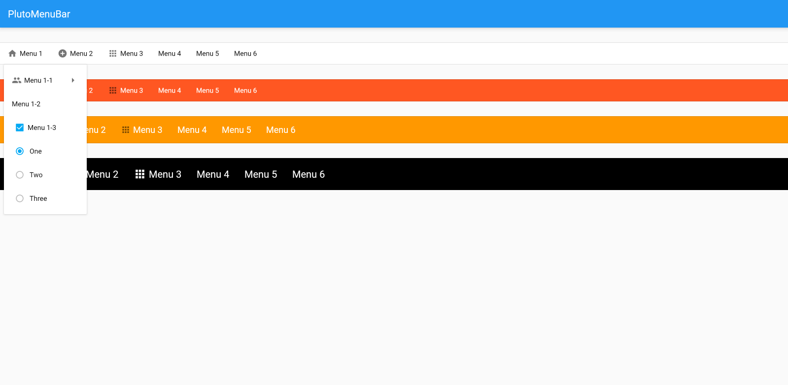
PlutoMenuBar is a menu bar that can add multiple sub menus. Works on all platforms supported by Flutter.
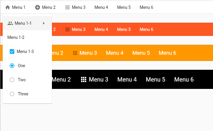
If there is a submenu, an arrow icon is displayed to the right of the menu item. Tapping on a menu item with this submenu brings up the following submenus. To return to the previous menu, simply tap the ‘Go Back’ menu item.
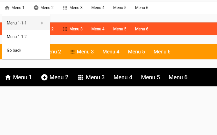
Type of menu item
PlutoMenuItemis a basic button type menu item.PlutoMenuItem.checkboxis the menu item that the checkbox widget appears.PlutoMenuItem.radiois the menu item where the radio button widget appears.
Set submenu
PlutoMenuItem can pass children attribute.
children is a List<PlutoMenuItem>? type, and the same PlutoMenuItem can be set as a submenu.
If the children value is not passed, it acts as a menu item with no submenu.
Full sample code
class MyApp extends StatelessWidget {
  const MyApp({Key? key}) : super(key: key);

  @override
  Widget build(BuildContext context) {
    return MaterialApp(
      debugShowCheckedModeBanner: false,
      home: Scaffold(
        appBar: AppBar(
          title: const Text('PlutoMenuBar'),
        ),
        body: const PlutoMenuBarDemo(),
      ),
    );
  }
}

class PlutoMenuBarDemo extends StatelessWidget {
  const PlutoMenuBarDemo({
    super.key,
  });

  void message(context, String text) {
    ScaffoldMessenger.of(context).hideCurrentSnackBar();

    final snackBar = SnackBar(
      content: Text(text),
    );

    ScaffoldMessenger.of(context).showSnackBar(snackBar);
  }

  List<PlutoMenuItem> getMenus(BuildContext context) {
    return [
      PlutoMenuItem(
        title: 'Menu 1',
        icon: Icons.home,
        children: [
          PlutoMenuItem(
            title: 'Menu 1-1',
            icon: Icons.group,
            onTap: () => message(context, 'Menu 1-1 tap'),
            children: [
              PlutoMenuItem(
                title: 'Menu 1-1-1',
                onTap: () => message(context, 'Menu 1-1-1 tap'),
                children: [
                  PlutoMenuItem(
                    title: 'Menu 1-1-1-1',
                    onTap: () => message(context, 'Menu 1-1-1-1 tap'),
                  ),
                  PlutoMenuItem(
                    title: 'Menu 1-1-1-2',
                    onTap: () => message(context, 'Menu 1-1-1-2 tap'),
                  ),
                ],
              ),
              PlutoMenuItem(
                title: 'Menu 1-1-2',
                onTap: () => message(context, 'Menu 1-1-2 tap'),
              ),
            ],
          ),
          PlutoMenuItem(
            title: 'Menu 1-2',
            onTap: () => message(context, 'Menu 1-2 tap'),
          ),
          PlutoMenuItem.checkbox(
            title: 'Menu 1-3',
            initialCheckValue: true,
            onTap: () => message(context, 'Menu 1-3 tap'),
            onChanged: (flag) => print(flag),
          ),
          PlutoMenuItem.radio(
            title: 'Menu 1-3',
            initialRadioValue: _RadioItems.one,
            radioItems: _RadioItems.values,
            onTap: () => message(context, 'Menu 1-3 tap'),
            onChanged: (item) => print(item),
            getTitle: (item) {
              switch (item as _RadioItems) {
                case _RadioItems.one:
                  return 'One';
                case _RadioItems.two:
                  return 'Two';
                case _RadioItems.three:
                  return 'Three';
              }
            },
          ),
        ],
      ),
      PlutoMenuItem(
        title: 'Menu 2',
        icon: Icons.add_circle,
        children: [
          PlutoMenuItem(
            title: 'Menu 2-1',
            onTap: () => message(context, 'Menu 2-1 tap'),
          ),
        ],
      ),
      PlutoMenuItem(
        title: 'Menu 3',
        icon: Icons.apps_outlined,
        onTap: () => message(context, 'Menu 3 tap'),
      ),
      PlutoMenuItem(
        title: 'Menu 4',
        onTap: () => message(context, 'Menu 4 tap'),
      ),
      PlutoMenuItem(
        title: 'Menu 5',
        onTap: () => message(context, 'Menu 5 tap'),
      ),
      PlutoMenuItem(
        title: 'Menu 6',
        children: [
          PlutoMenuItem(
            title: 'Menu 6-1',
            onTap: () => message(context, 'Menu 6-1 tap'),
            children: [
              PlutoMenuItem(
                title: 'Menu 6-1-1',
                onTap: () => message(context, 'Menu 6-1-1 tap'),
                children: [
                  PlutoMenuItem(
                    title: 'Menu 6-1-1-1',
                    onTap: () => message(context, 'Menu 6-1-1-1 tap'),
                  ),
                  PlutoMenuItem(
                    title: 'Menu 6-1-1-2',
                    onTap: () => message(context, 'Menu 6-1-1-2 tap'),
                  ),
                ],
              ),
              PlutoMenuItem(
                title: 'Menu 6-1-2',
                onTap: () => message(context, 'Menu 6-1-2 tap'),
              ),
            ],
          ),
          PlutoMenuItem(
            title: 'Menu 6-2',
            onTap: () => message(context, 'Menu 6-2 tap'),
          ),
        ],
      ),
    ];
  }

  @override
  Widget build(BuildContext context) {
    return Column(
      children: [
        const SizedBox(height: 30),
        PlutoMenuBar(
          menus: getMenus(context),
        ),
        const SizedBox(height: 30),
        PlutoMenuBar(
          backgroundColor: Colors.deepOrange,
          itemStyle: PlutoMenuItemStyle(
            activatedColor: Colors.white,
            indicatorColor: Colors.deepOrange,
            textStyle: const TextStyle(color: Colors.white),
            moreIconColor: Colors.white,
          ),
          menus: getMenus(context),
        ),
        const SizedBox(height: 30),
        PlutoMenuBar(
          backgroundColor: Colors.orange,
          height: 55,
          itemStyle: PlutoMenuItemStyle(
            activatedColor: Colors.white,
            indicatorColor: Colors.orange,
            textStyle: const TextStyle(color: Colors.white, fontSize: 18),
            moreIconColor: Colors.white,
          ),
          menus: getMenus(context),
        ),
        const SizedBox(height: 30),
        PlutoMenuBar(
          backgroundColor: Colors.black,
          itemStyle: PlutoMenuItemStyle(
            iconColor: Colors.white,
            iconSize: 26,
            moreIconColor: Colors.white,
            activatedColor: Colors.white,
            unselectedColor: Colors.white70,
            indicatorColor: Colors.black,
            textStyle: const TextStyle(color: Colors.white, fontSize: 20),
          ),
          height: 65,
          menus: getMenus(context),
        ),
      ],
    );
  }
}

enum _RadioItems {
  one,
  two,
  three,
}