Configuration

When creating a PlutoGrid, you can change the grid settings by passing PlutoGridConfiguration to the configuration property.
child: PlutoGrid(
  columns: columns,
  rows: rows,
  configuration: const PlutoGridConfiguration(),
),
enableMoveDownAfterSelecting
After a value is selected in the date, time, or selection type popup, the current cell position of the grid is moved down after the popup is closed.
enableMoveHorizontalInEditing
If the value is set to true, if you press the direction key once more after reaching the end of the left and right text in the edit state, the current cell moves in the entered direction.
If the value is set to false, the current cell cannot be moved with the left and right arrow keys in the editing state.
If the cell is not in edit state, the current cell can be moved left or right regardless of this value.
enterKeyAction
Sets the behavior of the Enter key when the current cell is selected.
PlutoEnterKeyAction.editingAndMoveDownswitches the current cell to the edit state when the enter key is pressed if the current cell is not in the edit state.
If you press the Enter key once more in the edit state, the current cell position is moved to the cell below.PlutoEnterKeyAction.editingAndMoveRightconverts the current cell to the edit state when the enter key is pressed if the current cell is not in the edit state.
If you press the Enter key once more in the edit state, the current cell position is moved to the right.PlutoEnterKeyAction.toggleEditingtoggles the editing status of the current cell when the Enter key is pressed, and does not move the current cell position.PlutoGridEnterKeyAction.nonedoes not perform any action when the enter key is pressed.
style
This is the style setting for PlutoGrid.
configuration: const PlutoGridConfiguration(
  style: PlutoGridStyleConfig(
    enableGridBorderShadow: true,
  ),
),
Options of style
enableGridBorderShadow enables shadowing on the grid's borders.
enableColumnBorderVertical enables vertical dividing borders between columns.
enableColumnBorderHorizontal enables horizontal borders for columns.
enableCellBorderVertical enables cell-to-cell vertical separator borders.
enableCellBorderHorizontal enables horizontal boarding of cells.
enableRowColorAnimation enables the animation effect of the background color of a row when the current row position is moved.
Colors of style
gridBackgroundColor sets the background color of the grid.
rowColor sets the background color of the row.
oddRowColor sets the background color of the odd-numbered row.
evenRowColor sets the background color of the even-numbered row.
activatedColor sets the background color of the currently focused row or cell.
checkedColor sets the background color of the selected row.
cellColorInEditState sets the background color of the cell when the cell is in edit state.
cellColorInReadOnlyState sets the background color when the cell is in the edit state and the cell is a read-only cell.(PlutoColumn.readonly)
dragTargetColumnColor sets the background color of the column to be dragged when the column is moved by dragging it.
If it is impossible to move to the position of the column that is the drag target, the background color of the column of the drag target does not change.
(In the case of a fixed column, if the overall width is narrow, the position is limited)
iconColor sets the color of the icon used by default inside the grid.
disabledIconColor sets the color of the icon's disabled state.
menuBackgroundColor sets the background color of the menu popup on the right side of the column.
gridBorderColor sets the border color of the grid.
borderColor sets the border color of columns, column groups, cells, and rows.
activatedBorderColor sets the border color when a row or cell receives focus.
inactivatedBorderColor sets the border color when a row or cell loses focus.
Sizes of style
iconSize sets the size of the icon used by default inside the grid.
rowHeight sets the height of the row.
columnHeight sets the height of the column.
columnFilterHeight sets the height of the column filter.
defaultColumnTitlePadding sets the padding of the column title area.
defaultColumnFilterPadding sets the padding of the column filter area.
defaultCellPadding sets the padding of the cell.
TextStyle of style
columnTextStyle sets the text style of the column.
cellTextStyle sets the text style of the cell.
Icons of style
columnContextIcon sets the menu icon to the right of the column title.
columnResizeIcon sets the resize icon to the right of the column title. (In case PlutoColumn.enableContextMenu is false.)
Border radius of style
gridBorderRadius sets the border radius of the grid.
gridPopupBorderRadius sets the border radius of the popup inside the grid.
scrollbar
It is the horizontal and vertical scroll bar setting of the grid.
configuration: PlutoGridConfiguration(
  scrollbar: const PlutoGridScrollbarConfig(
    isAlwaysShown: false,
    scrollbarThickness: 8,
    scrollbarThicknessWhileDragging: 10,
  ),
),
draggableScrollbar is whether the scrollbar can be scrolled by dragging it.
isAlwaysShown determines whether the scrollbar will remain visible.
scrollbarRadius sets the radius of the scrollbar.
scrollbarRadiusWhileDragging sets the radius while dragging the scrollbar.
scrollbarThickness sets the thickness of the scrollbar.
scrollbarThicknessWhileDragging sets the thickness when the scrollbar is being dragged.
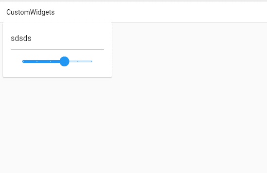
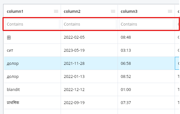
columnFilter
This is the filter setting for the column.
If you press F3 while the cell is in focus, the focus is moved to the filter input box of the column of the current cell.
If you press the F3 key again in the filter input box, a filtering pop-up is called where you can set the entire filtering.
If you press ESC in the filter input box, it will return to the previous cell position.
If you enter the arrow down key in the filter input box, it moves to the first cell of the column.
configuration: const PlutoGridConfiguration(
  columnFilter: PlutoGridColumnFilterConfig(),
),
Default column filter type
The built-in column filters are set in the FilterHelper.defaultFilters static property.
If no columnFilter is set, a default filter is provided.
PlutoFilterTypeContainschecks whether the filter input value is included in the values of the cells of the corresponding column.RegExp : /filter input value/PlutoFilterTypeEqualschecks whether the filter input value matches the values of the cells of the corresponding column.RegExp : /^Filter input value$/PlutoFilterTypeStartsWithchecks whether the filter input value matches the value of the cells in the corresponding column.RegExp : /^Filter input value/PlutoFilterTypeEndsWithmeans that the filter input value is the cell of the corresponding column.RegExp : /Filter input value$/PlutoFilterTypeGreaterThanchecks whether the filter input value is greater than the value of the cells in the corresponding column.
According to the definition of thePlutoColumn.type.comparefunction.PlutoFilterTypeGreaterThanOrEqualTochecks whether the filter input value is greater than or equal to the value of the cells in the corresponding column.
According to the definition of thePlutoColumn.type.comparefunction.PlutoFilterTypeLessThanchecks whether the filter input value is less than the value of the cells of the corresponding column.
According to the definition of thePlutoColumn.type.comparefunction.PlutoFilterTypeLessThanOrEqualTochecks whether the filter input value is less than or equal to the value of the cells of the corresponding column.
According to the definition of thePlutoColumn.type.comparefunction.
User-Defined Column Filters
The example code below applies different filters depending on the PlutoColumn.field .
columnFilter: PlutoGridColumnFilterConfig(
  filters: const [
    ...FilterHelper.defaultFilters,
    // custom filter
    ClassYouImplemented(),
  ],
  resolveDefaultColumnFilter: (column, resolver) {
    if (column.field == 'text') {
      return resolver<PlutoFilterTypeContains>() as PlutoFilterType;
    } else if (column.field == 'number') {
      return resolver<PlutoFilterTypeGreaterThan>()
          as PlutoFilterType;
    } else if (column.field == 'date') {
      return resolver<PlutoFilterTypeLessThan>() as PlutoFilterType;
    } else if (column.field == 'select') {
      return resolver<ClassYouImplemented>() as PlutoFilterType;
    }

    return resolver<PlutoFilterTypeContains>() as PlutoFilterType;
  },),

class ClassYouImplemented implements PlutoFilterType {
  @override
  String get title => 'Custom contains';

  @override
  get compare => ({
        required String? base,
        required String? search,
        required PlutoColumn? column,
      }) {
        var keys = search!.split(',').map((e) => e.toUpperCase()).toList();

        return keys.contains(base!.toUpperCase());
      };

  const ClassYouImplemented();
}
The ClassYouImplemented class that implements PlutoFilterType filters whether multiple options are included by separating the filter input value with , in case of a select type column.
If the column has the select option ['one', 'two', 'three']
If you enter the filter input value as one, two, cases containing one or two will be filtered.
columnSize
You can change the column width automatically or set the column width adjustment condition.
configuration: const PlutoGridConfiguration(
  columnSize: PlutoGridColumnSizeConfig(),
),
autoSizeMode
Automatically change the width of a column in situations such as when the grid starts or the width of the grid changes.
If the total width of the grid is insufficient and all columns reach the minimum width, horizontal scrolling may occur because the total width of the column becomes larger than the entire grid.
If autoSizeMode is applied in a state other than none, if resizeMode is also applied as PlutoResizeMode.pushAndPull, the width of columns can be changed not to exceed the total width of the grid.
PlutoAutoSizeMode.none disables auto change of width.
PlutoAutoSizeMode.equal changes all columns to the same width.
PlutoAutoSizeMode.scale changes the column width proportionally according to the current width of each column.
In autoSizeMode, there is an option to set whether autoSizeMode is applied again according to the state of a column being moved, hidden or unhidden, etc.
restoreAutoSizeAfterHideColumndetermines whetherautoSizeModeis reapplied after a column is hidden or unhidden.restoreAutoSizeAfterFrozenColumndetermines whetherautoSizeModeis reapplied after the column's frozen state is changed.restoreAutoSizeAfterMoveColumndetermines whetherautoSizeModeis reapplied after a column is moved.restoreAutoSizeAfterInsertColumndetermines whetherautoSizeModeis applied again after a new column is added.restoreAutoSizeAfterRemoveColumndetermines whetherautoSizeModeis reapplied after a column is deleted.
resizeMode
Set the condition to change the width of the column.
PlutoResizeMode.none disables changing the column width.
In PlutoResizeMode.normal, when the width of a column is changed, only the width of the corresponding column is changed.
In this case, the overall scroll width of the grid is also widened or narrowed.
PlutoResizeMode.pushAndPull operates to change the width of the corresponding column within the entire grid width, and to widen or narrow the width of the surrounding columns by that much.
localeText
Change the language of the characters used inside the grid. If the value is not set, it is set to English.
Built-in languages
English PlutoGridLocaleText()
Chinese PlutoGridLocaleText.china()
Korean PlutoGridLocaleText.korean()
Russian PlutoGridLocaleText.russian()
Czech PlutoGridLocaleText.czech()
brazilianPortuguese PlutoGridLocaleText.brazilianPortuguese()
Spanish PlutoGridLocaleText.spanish()
Persian PlutoGridLocaleText.persian()
Arabic PlutoGridLocaleText.arabic()
Change the default language set
configuration: const PlutoGridConfiguration(
  localeText: PlutoGridLocaleText(
    unfreezeColumn: 'Unpin column',
    freezeColumnToStart: 'Pin column to left',
  ),
),